Bento UI: The Art of Organization
From Marie Kondo to Bento UI. The Philosophy of Order in Design.
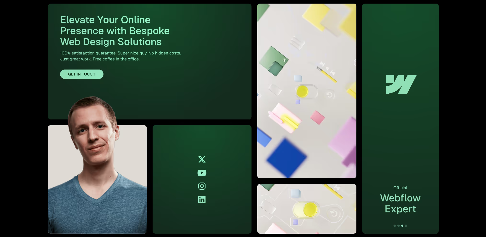
Source: Ui of Jonas Arleth - one of my favourite designers
Introduction
Imagine a handful of pixels scattered across a canvas. Do you see random dots, or do you perceive a structure and shapes? Humans have an innate need to impose order on chaos. In the digital world, this need is fulfilled by Bento Grids – a design approach that harmoniously blends aesthetics with functionality.

The History of Bento Grids
Some claim that the Bento philosophy was pioneered by Microsoft's Metro UI, while others attribute it to Apple – well, this is debateable. What we know is that the name Bento comes from the bento box, and behind it all stands… yes, the most organized person in the world, Marie Kondo (wink-wink). If you’re not familiar with her, beware, as she might change your life forever.
But seriously, what connects Marie Kondo with the bento box? The philosophy of tidiness. Just as the bento box organizes diverse ingredients into perfectly arranged sections, Marie Kondo helps people organize their space, keeping what brings a spark of joy and eliminating clutter. Bento Grids in UI do exactly the same – they organize interface elements, giving them meaning and purpose. I’ll show you how to use Bento Grids to design interfaces that not only organize but also brings a spark of joy.
What are Bento Grids?
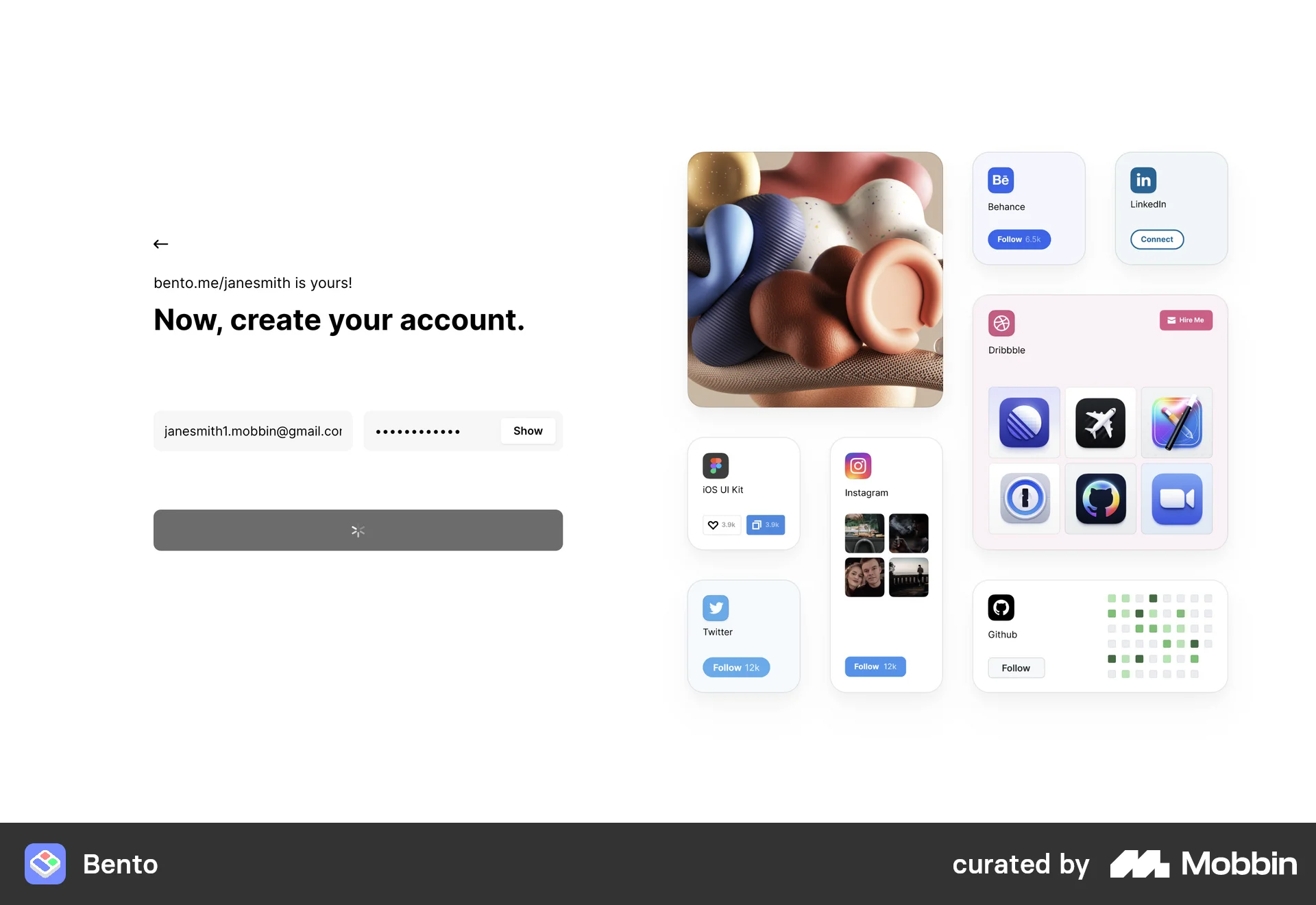
Bento Grids are inspired by Japanese bento boxes. Each "section" in a Bento Grid resembles a part of a bento box – organized, modular, and functional. Instead of traditional columns and rows, Bento Grids offer flexible blocks of varying sizes that can be arranged in different configurations to fit the content’s needs and hierarchy.
Designing in the Bento style involves creating a clear hierarchy of elements and maintaining balance among them – although most of these layouts are asymmetrical, they are thoughtfully arranged. This approach allows for the dynamic, organized, and aesthetically pleasing presentation of content, which truly brings “a spark of joy” to users. Bento Grids not only organize elements but also enhance their message, creating interfaces that are both functional and emotionally satisfying. And we all know how important emotions are in UX.
Key Features of Bento UI
Bento UI wins the hearts of designers and users alike with its flexibility and intuitiveness. Here are the key advantages of this style:
- Effortless Adaptability: The Bento style allows for rapid creation of projects for various devices. Thanks to modern CSS Grid technology, developers can build tab-based interfaces more quickly. Bento UI enables the creation of organized layouts with a clear hierarchy, directing the user’s attention to the most important content and prioritizing it.
- Responsiveness: Bento UI is inherently responsive, meaning it adapts well to different screen sizes. This structure helps users quickly and instictively find information, just as a bento box separates different dishes into distinct compartments. This means users spend less time searching for necessary buttons and sections.
- Minimalist and Universal: Rectangular and square shapes create a balanced interface that is both comfortable and pleasant to use. Bento UI can be applied to any interface, regardless of the type of digital product or brand.

Best Uses for Bento Grids
- E-commerce Sites: Perfect for organizing product categories and featured items. Flexible blocks allow for visually appealing presentation of product details.
- Portfolios: Ideal for showcasing creative work such as photography, graphics, or artistic projects. The modular layout allows for effective presentation of diverse projects.
- Dashboards and Data Visualization: Helps organize data in a clear and interpretable manner, improving data comprehension.
- Mobile Apps: Enables the creation of clear, responsive interfaces that support easy navigation between functions on various devices.
The impact of the Bento concept can also be seen in smart TV and smartwatch interfaces, as well as blogs and news platforms. Additionally, Bento works well for dashboards that do not overwhelm users with information, making it a top choice for SaaS startups.
How to Design with the Bento Idea?
Step 1. Create a Grid
Step 2. Arrange Content
Step 3. Play with Scales and Group Elements
Or simply skip all the steps and use the Bento Grid Maker plugin in Figma.
Conclusion
Never thought I'd do that much writing on a topic that could be summed up in one sentence. However, if you, like me, prefer getting straight to the point and skipping the entire article, you’ve missed out on my literary flair. Briefly, Bento is a concept brilliantly simple in its essence: organizing content by selecting what is most important. The essence of Bento is not in its playful style, colourful elements, or rounded corners; it is in the art of deciding what catches the eye immediately and what will attract the user’s attention later. Everything presented in a way that not just sparks joy but also makes the interaction with the content even more engaging.
Sustainable UI Design ↗
2024 · 6 min read