End-to-End Design for MooC Rental Platform
This project involved creating a streamlined heavy equipment rental system for one of the largest companies in the USA. Let's take a sneak peek.
Background
Due to NDA constraints, I've modified some details, but the core of the project remains intact.
MooC is the largest heavy equipment rental service in the USA. It works like Airbnb for heavy rental.
Project brief
Designing new features to help users get immediate, real-time data instead of sending emails and calling customer service. Designing the Customer App and essential functions, for instance rental data & financials dashboard, bulk orders, reporting tools.
Team
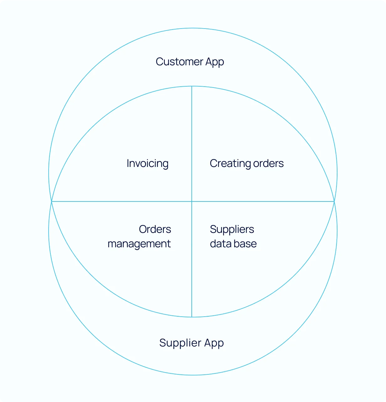
UI/UX designer in a team of 4. The company MooC decided to create applications to streamline the equipment ordering process for both suppliers and customers. The internal application, named the MooC ecosystem, consists of four different applications serving various functions for teams such as accounting, order management, sales and fulfilment, and supplier database.
My responsibility was to design applications for the external users and support the team with work on the rest of the applications. Together with Magda, we created a design system for the Customer App and Supplier App, then each of us were responsible for one of the applications.
Challange
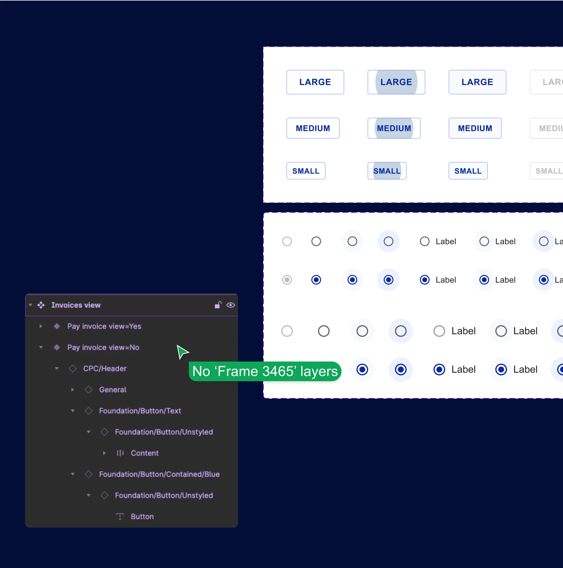
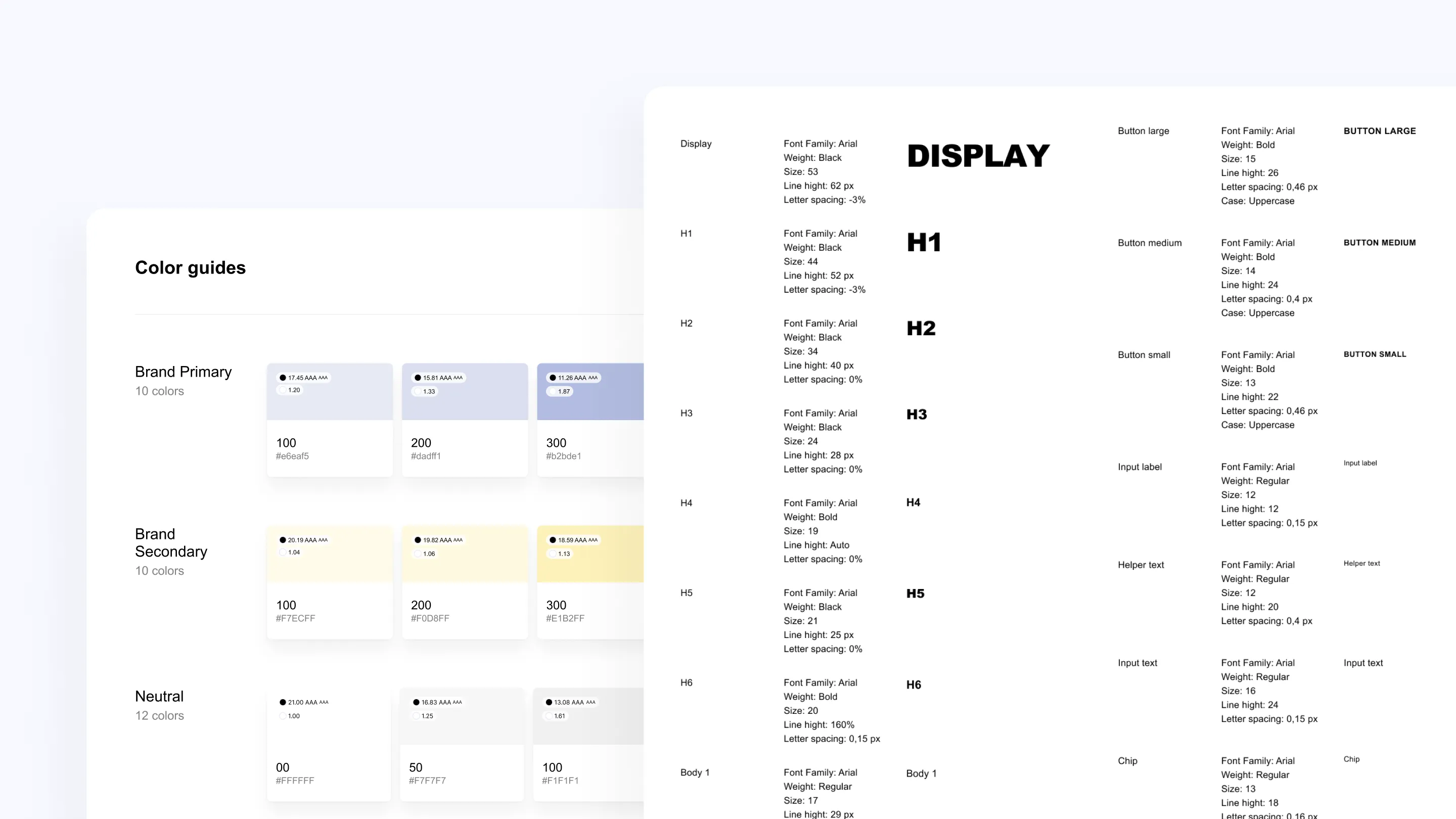
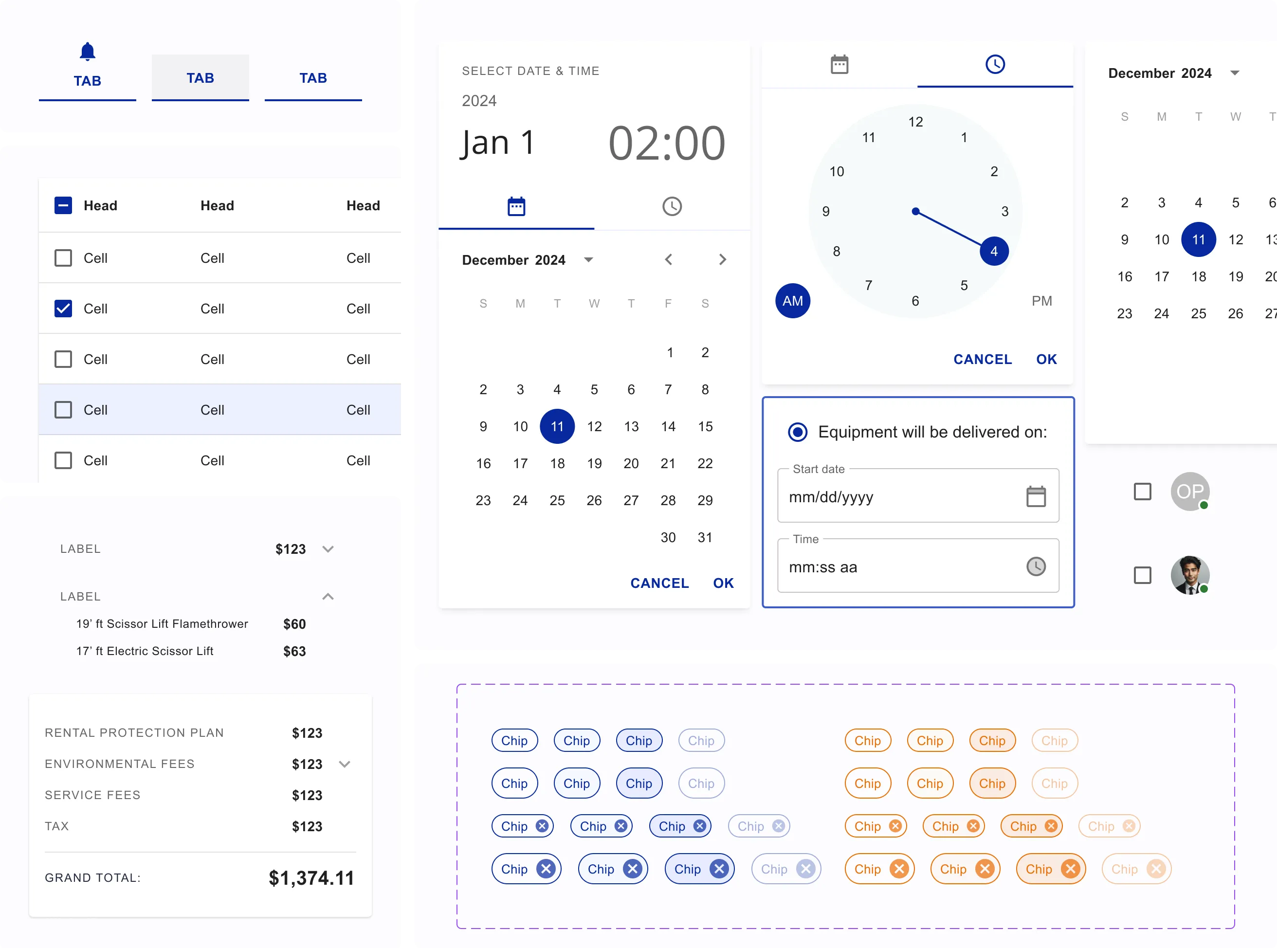
MooC's rapid growth led to a complex and fragmented system, necessitating a streamlined redesign for efficiency. Using the Atomic Design methodology, we built intricate components, resulting in a design system with over 2000 elements. We leveraged React's MUI library, customizing it as needed to suit MooC's specific requirements.
Project stages
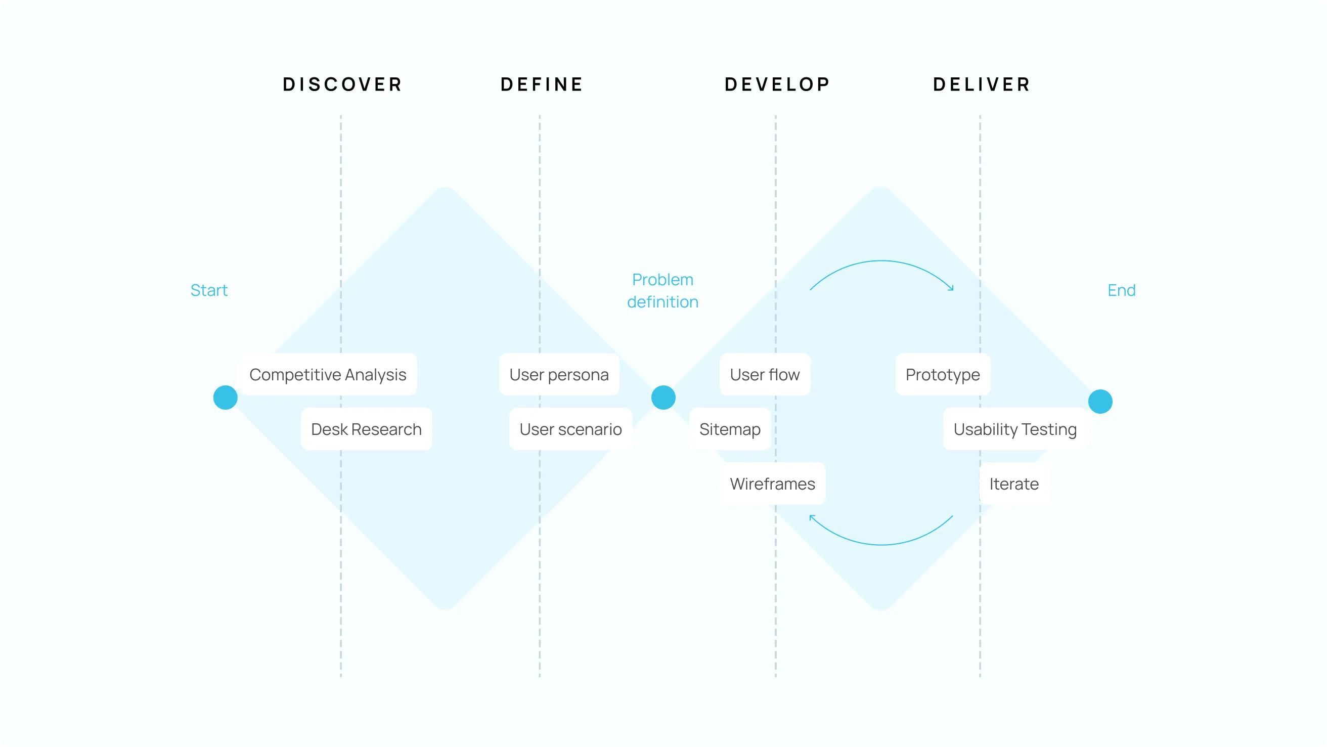
In our process, we utilized the Double Diamond framework to guide our work effectively. Briefly, I gathered data and defined project requirements. I identified key issues, refined information architecture, created sitemap, designed broad design system, crafted protytypes in order to perform user tests, and I wrote script for tests.
I used those tools:





Streamlining the Online Store
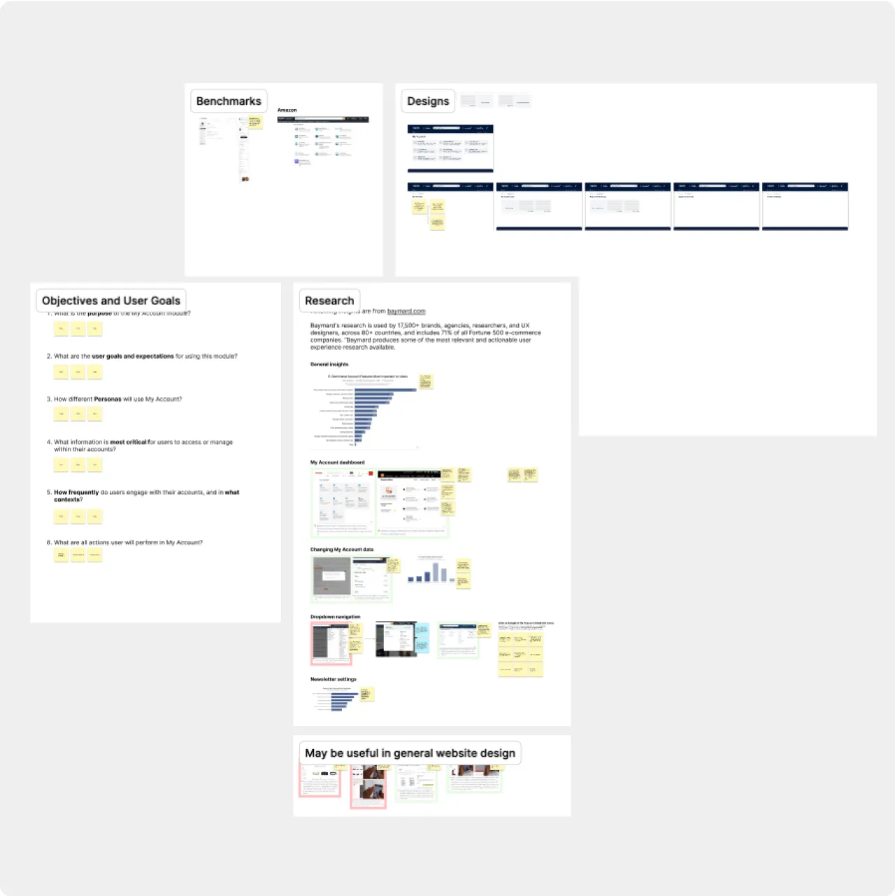
To enhance the entire order system, we needed to optimize the online store, making product searches and purchases quicker and easier. I received personas related data from the client, then I analysed the information architecture, identifying where users faced difficulties and gaining insights into their mental models.
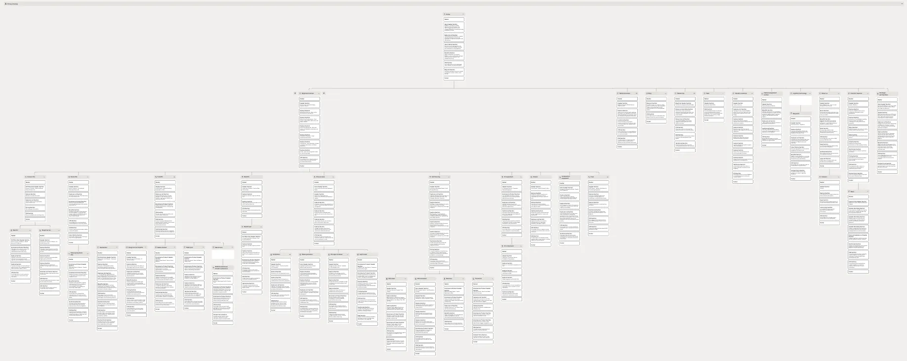
Although direct user access wasn't available, I conducted tree testing with the client's team. This helped streamline the information architecture and identify redundant content. Meanwhile, team members performed a competitor analysis. Throughout the design process, we collaborated closely as a team of 4, ensuring a cohesive and effective solution.
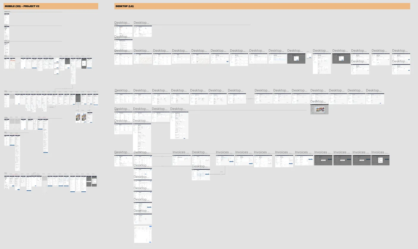
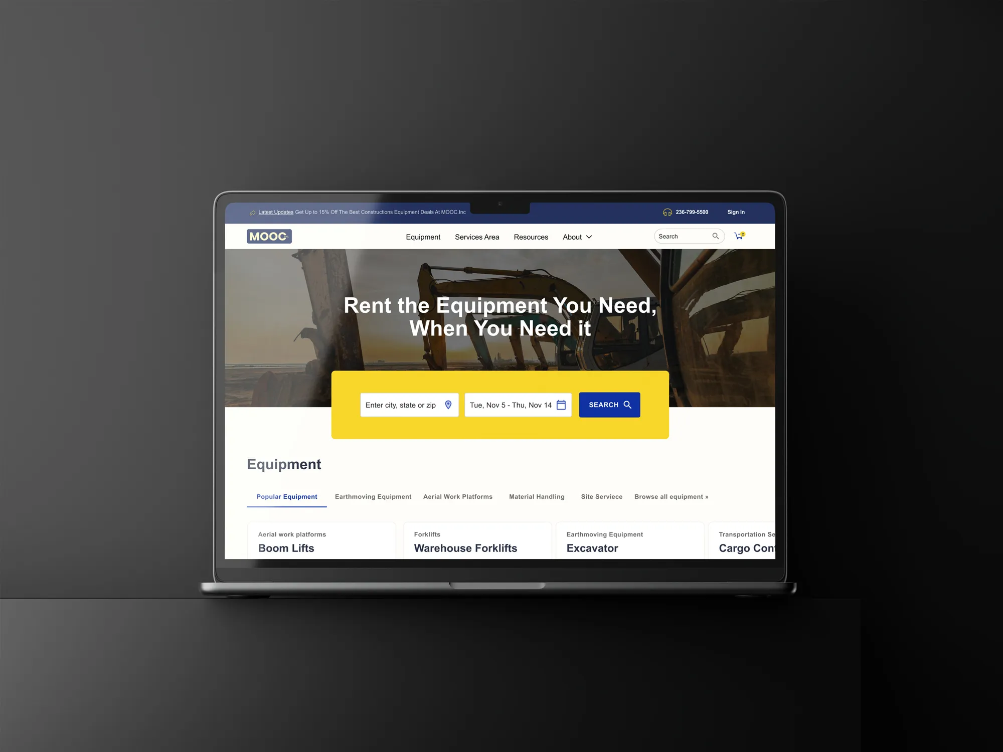
Customer App
MooC needed to streamline the processes for purchasing, ordering, and managing fulfilment without relying on phone calls. Previously, their clients managed job sites through phone calls or emails. The implementation of my work provided efficiency, improving their overall workflow.
Develop stage
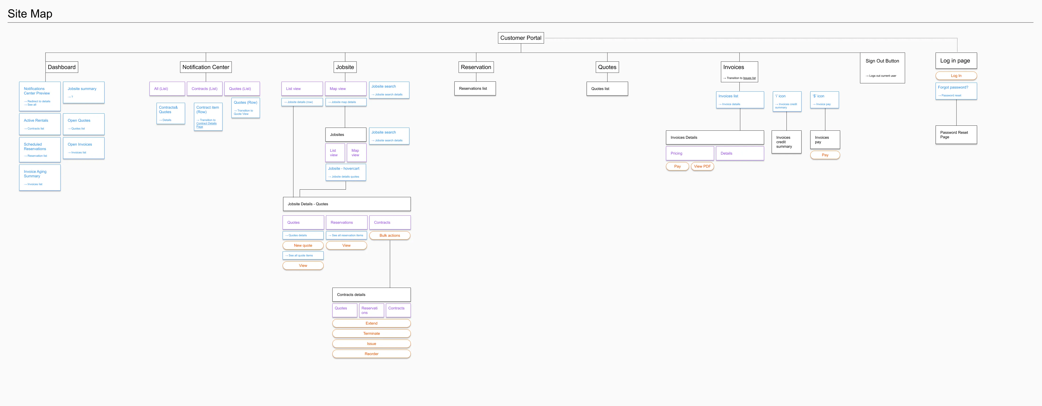
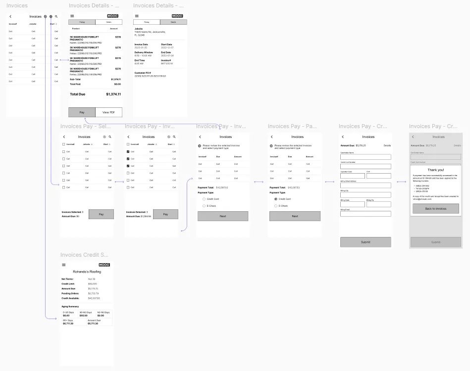
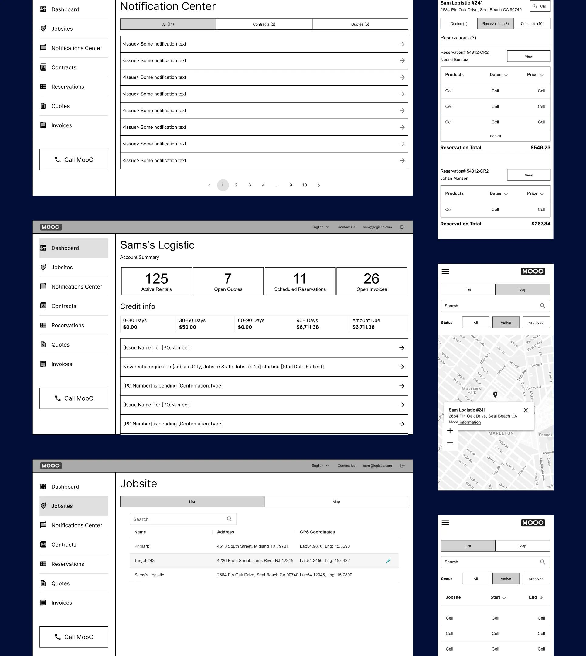
I crafted user flows, sitemaps, and lo-fi wireframes to map out user interactions and content structure, refining design concepts and enhancing the overall user experience.
Design system
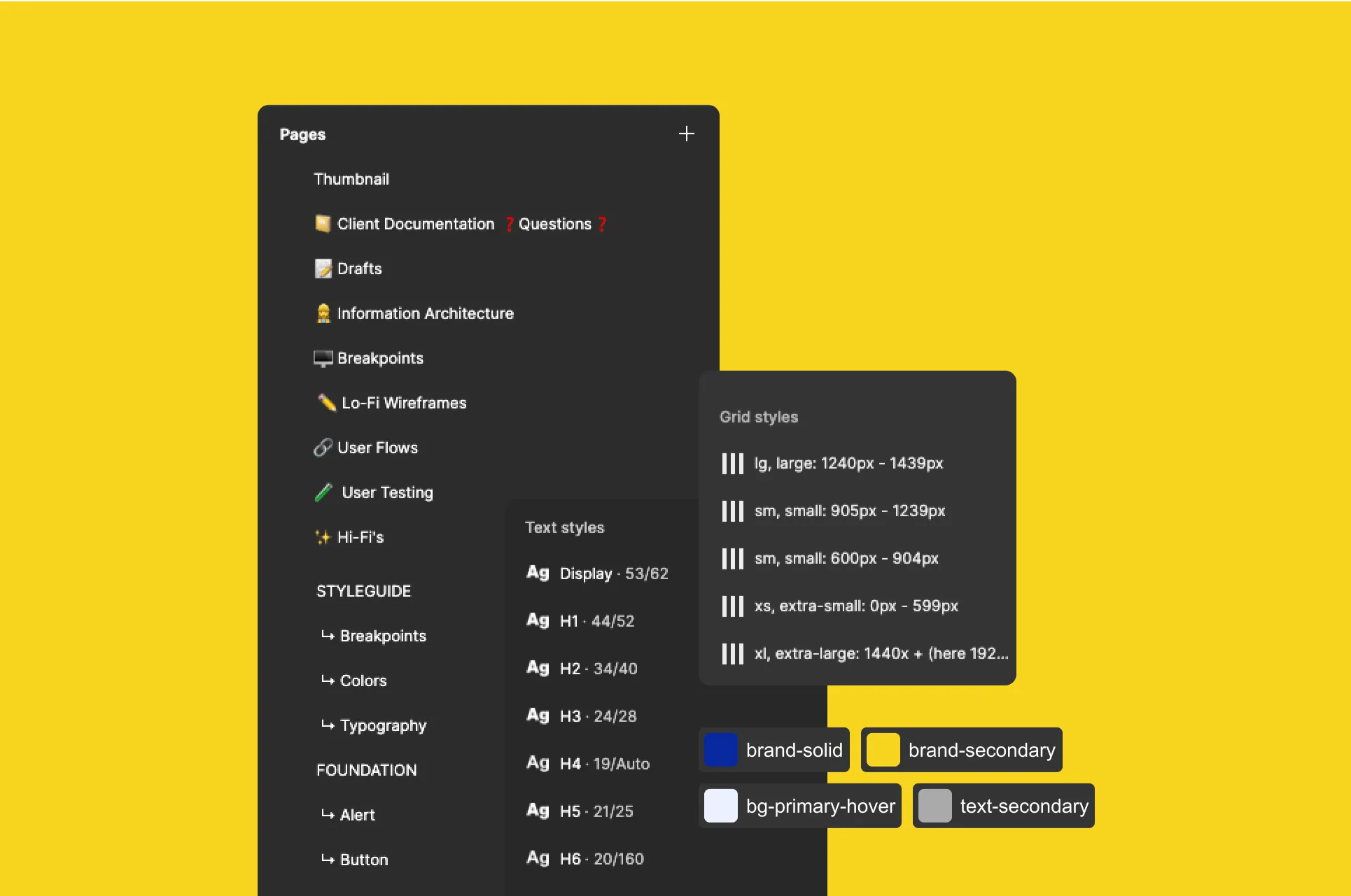
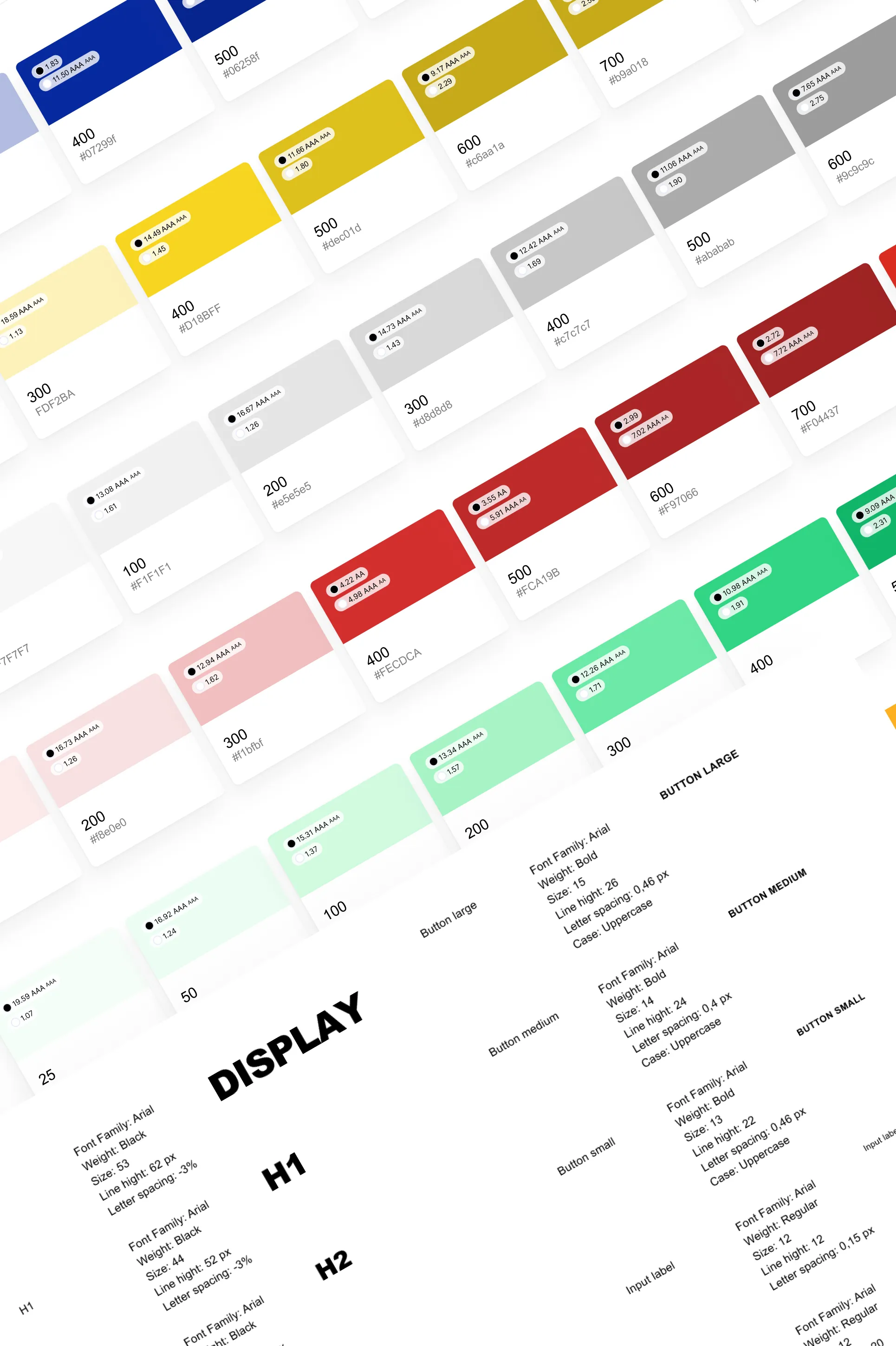
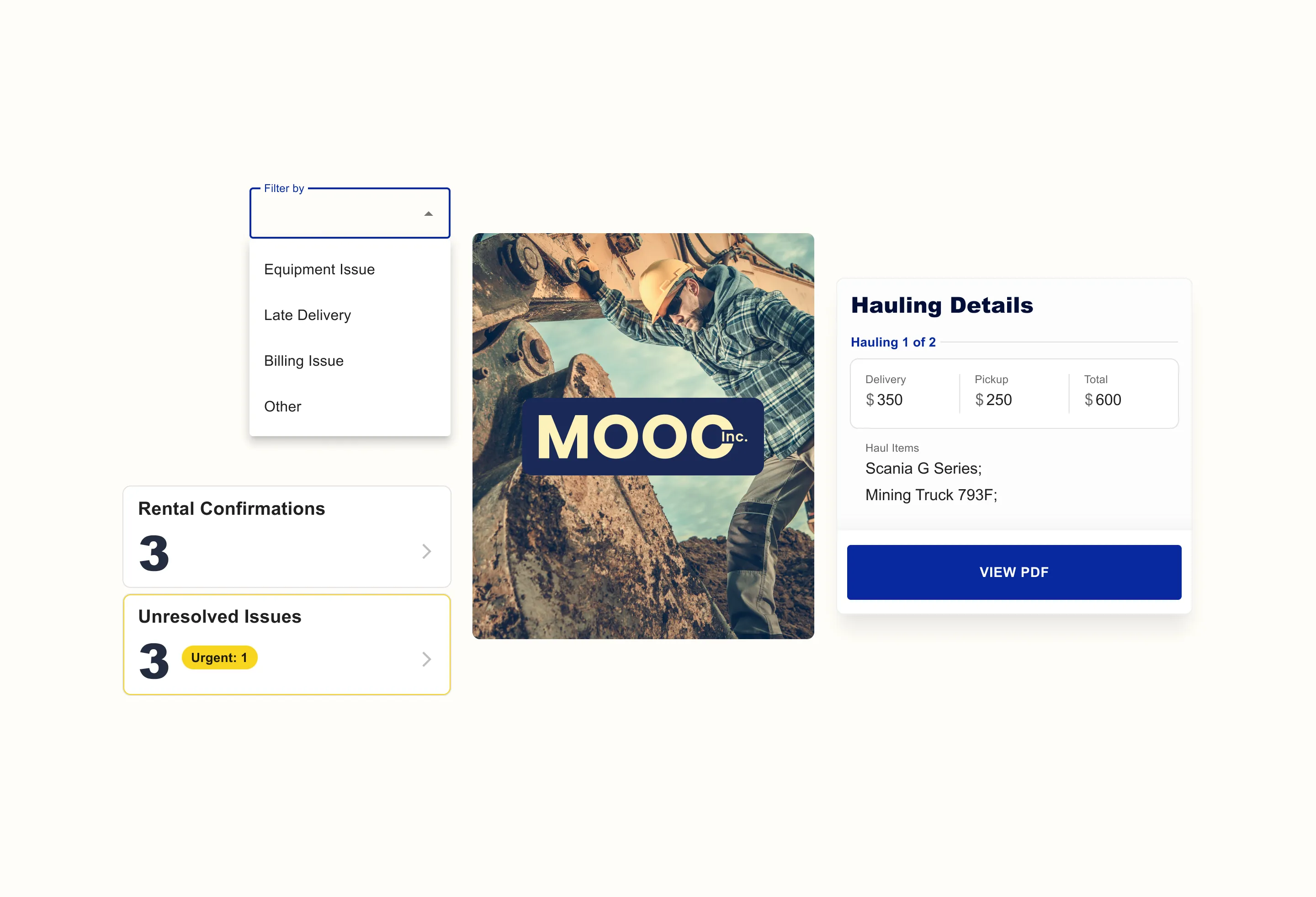
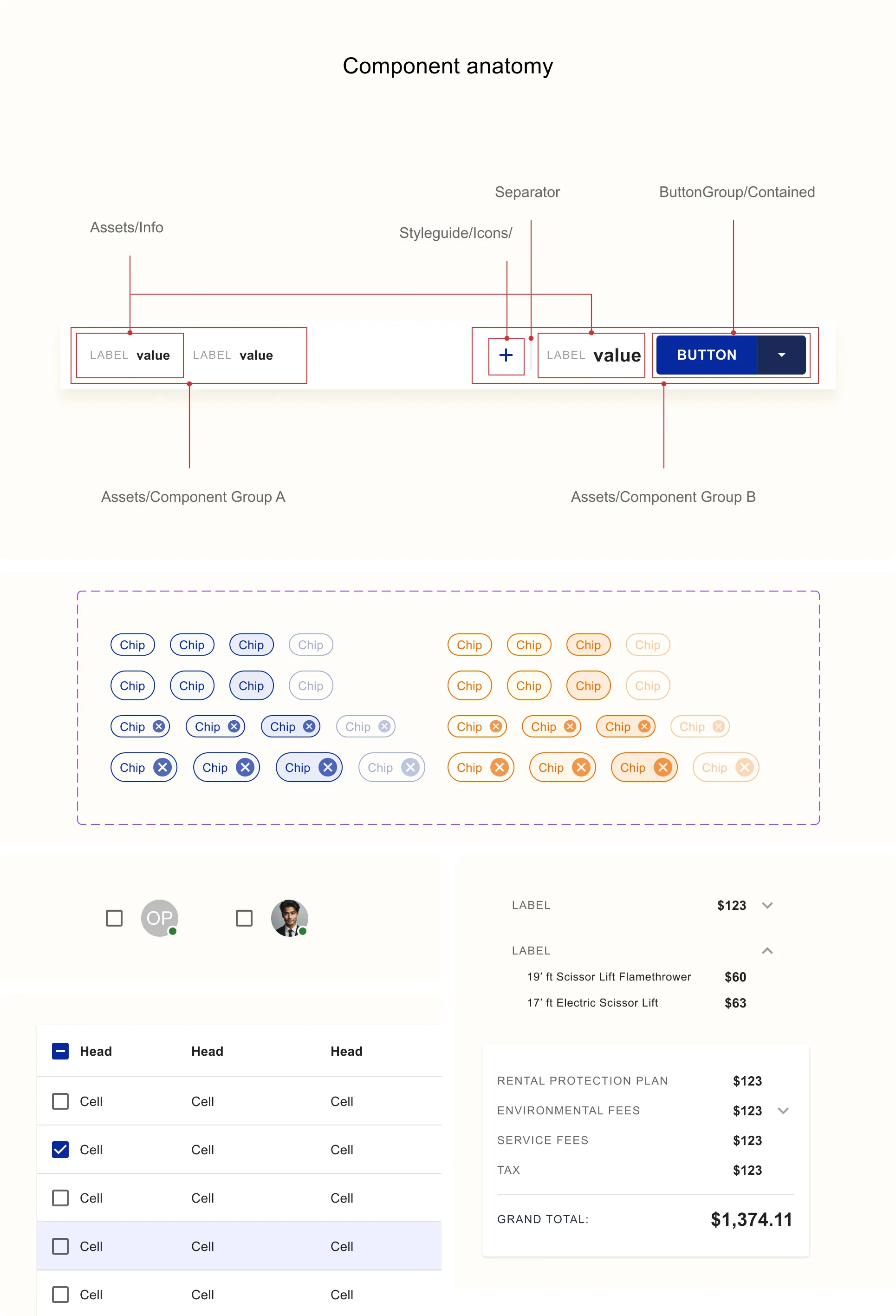
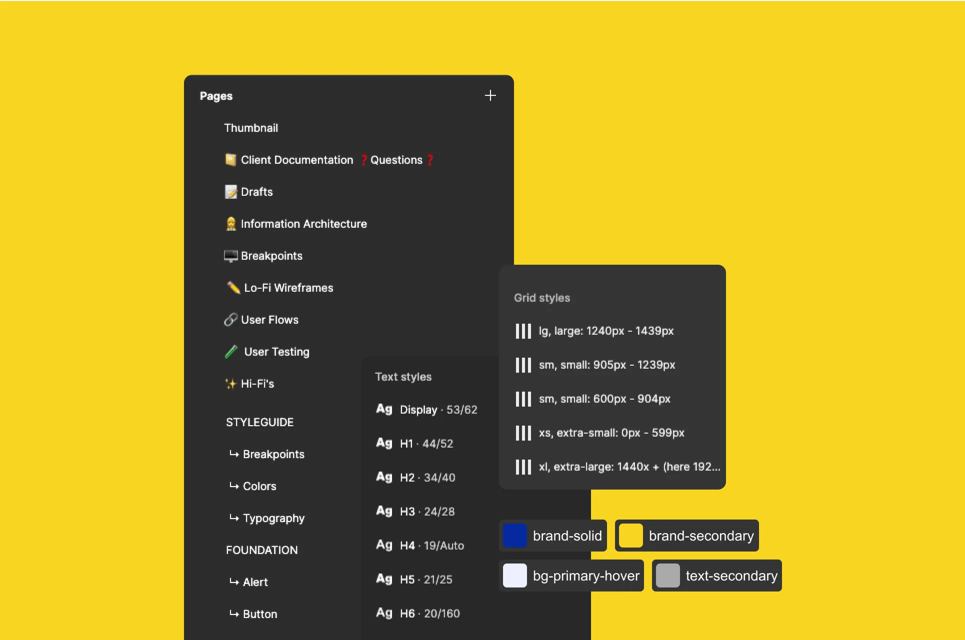
As the Customer App was a part of a bigger system, I co-created the design system with another designer. Creating a comprehensive and carefully structured design system was a groundbreaking change for MooC.
It ensured all products looked and felt coherent, while also enabling scalable growth with minimal effort.
Final designs
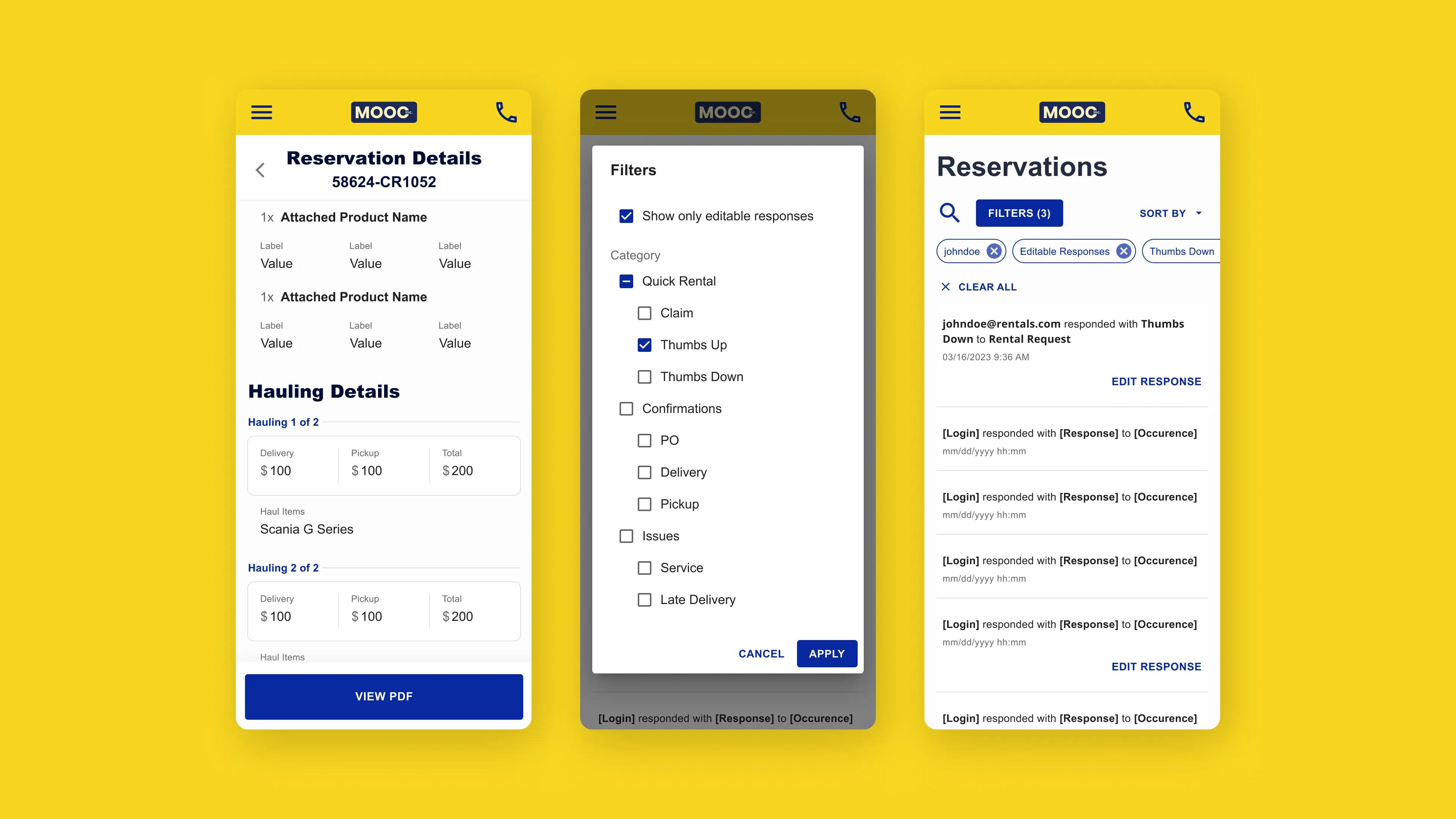
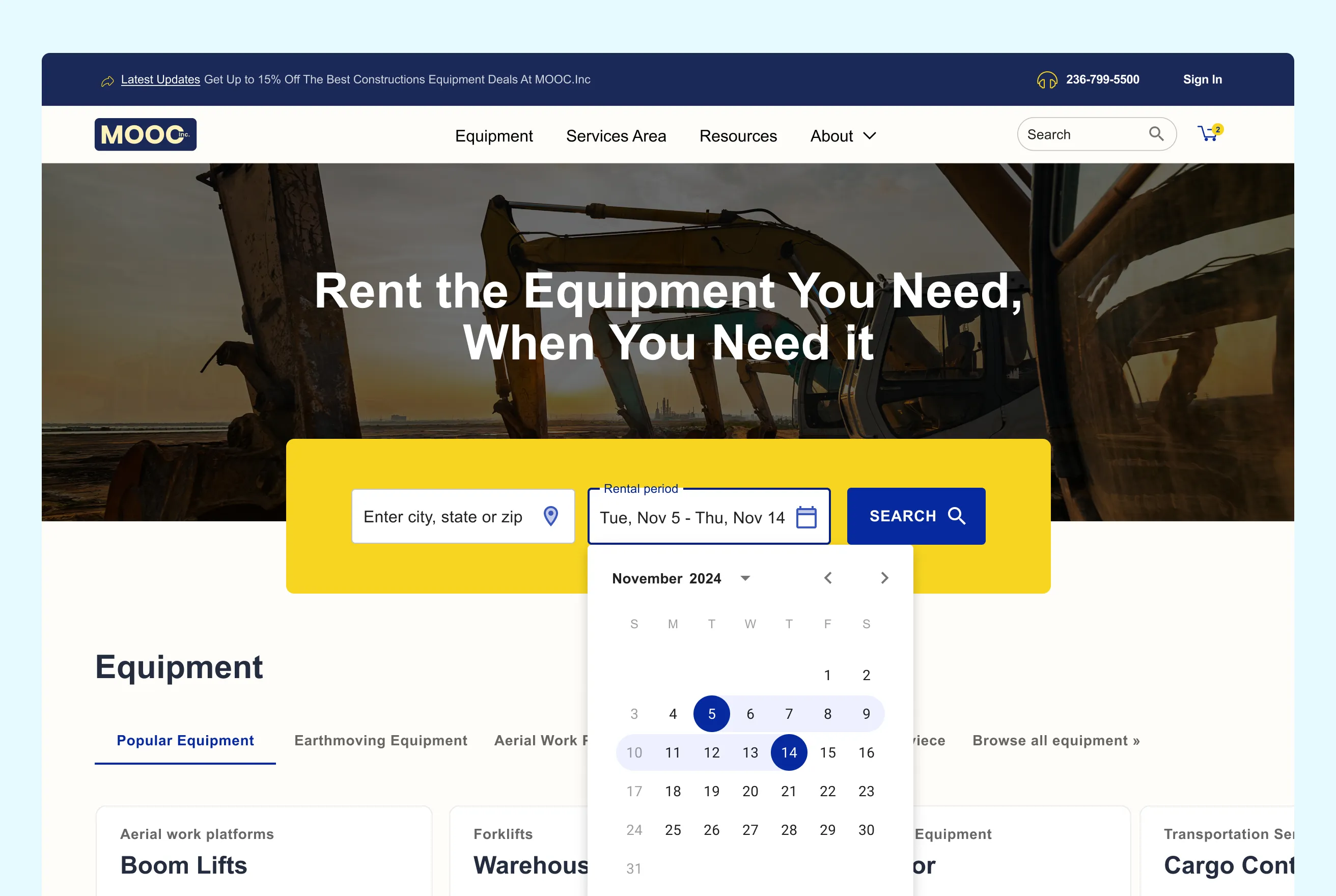
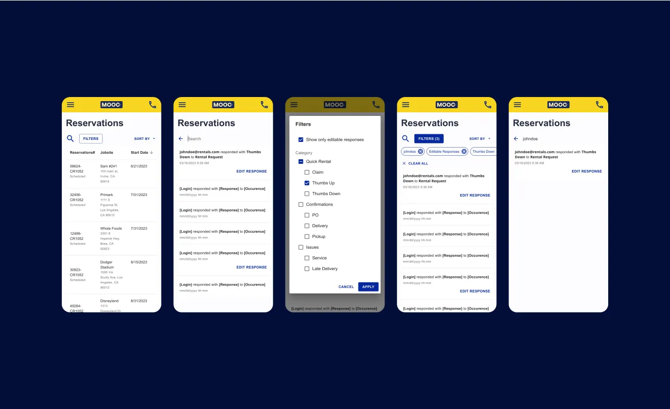
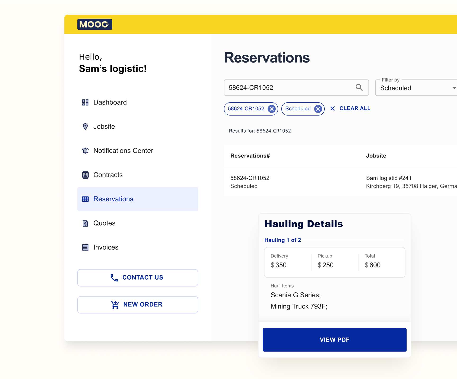
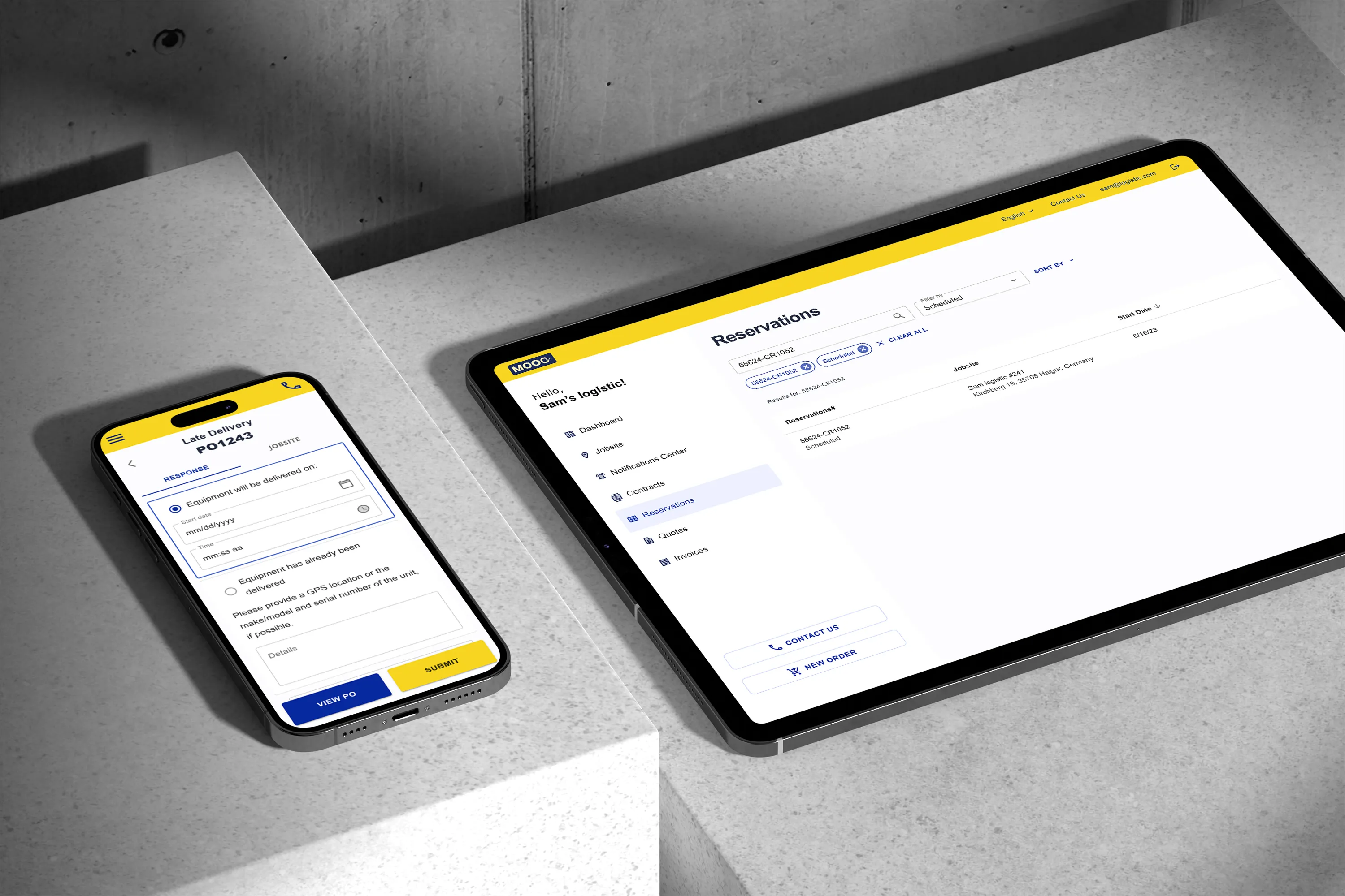
With three target groups using the Customer App in diverse environments, I streamlined the UI for efficiency.
I kept navigation in a visible sidebar, ensuring easy access, and designed clear navigation, robust search and filters, a minimalist layout, structured data presentation, accessible assistance, prominent CTAs, and responsive feedback.
These choices deliver a seamless, intuitive experience, no matter where the app is used.
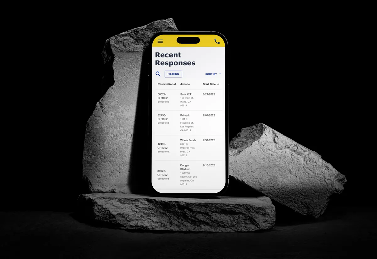
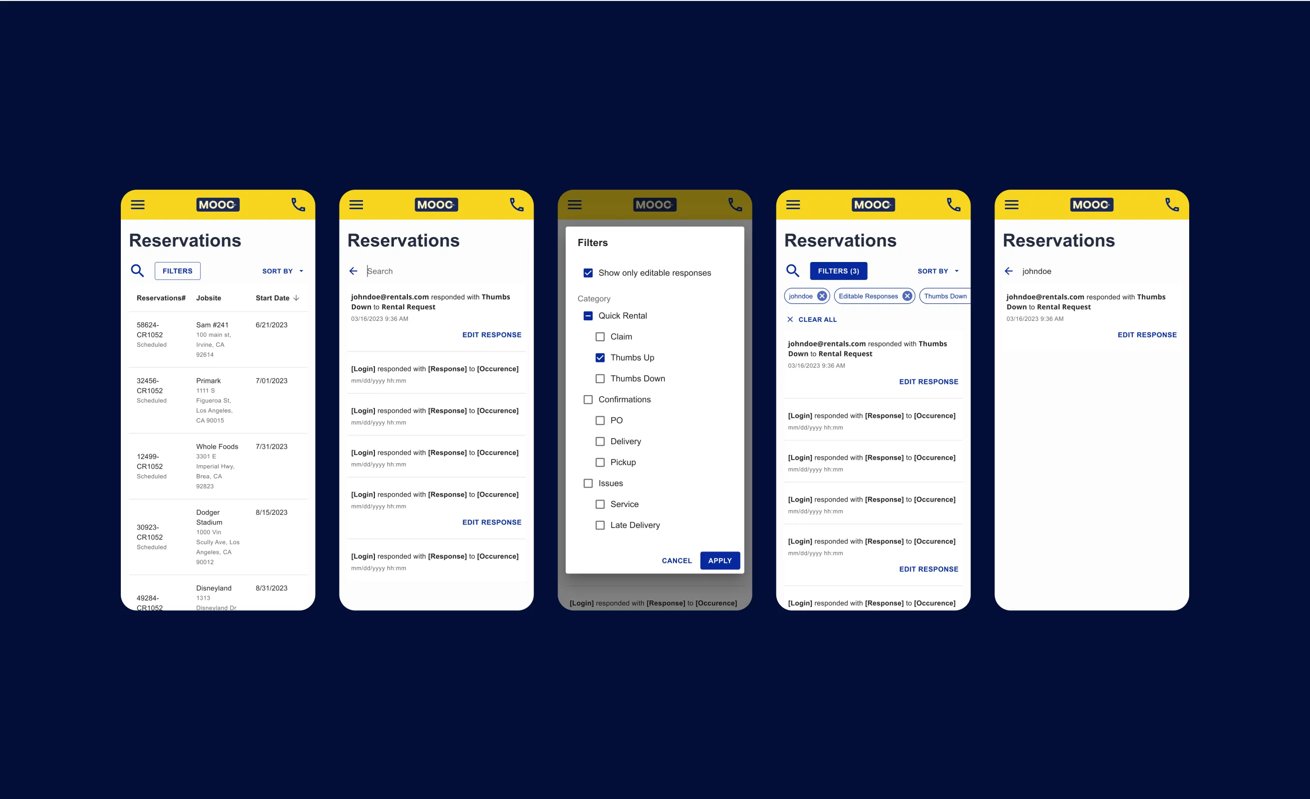
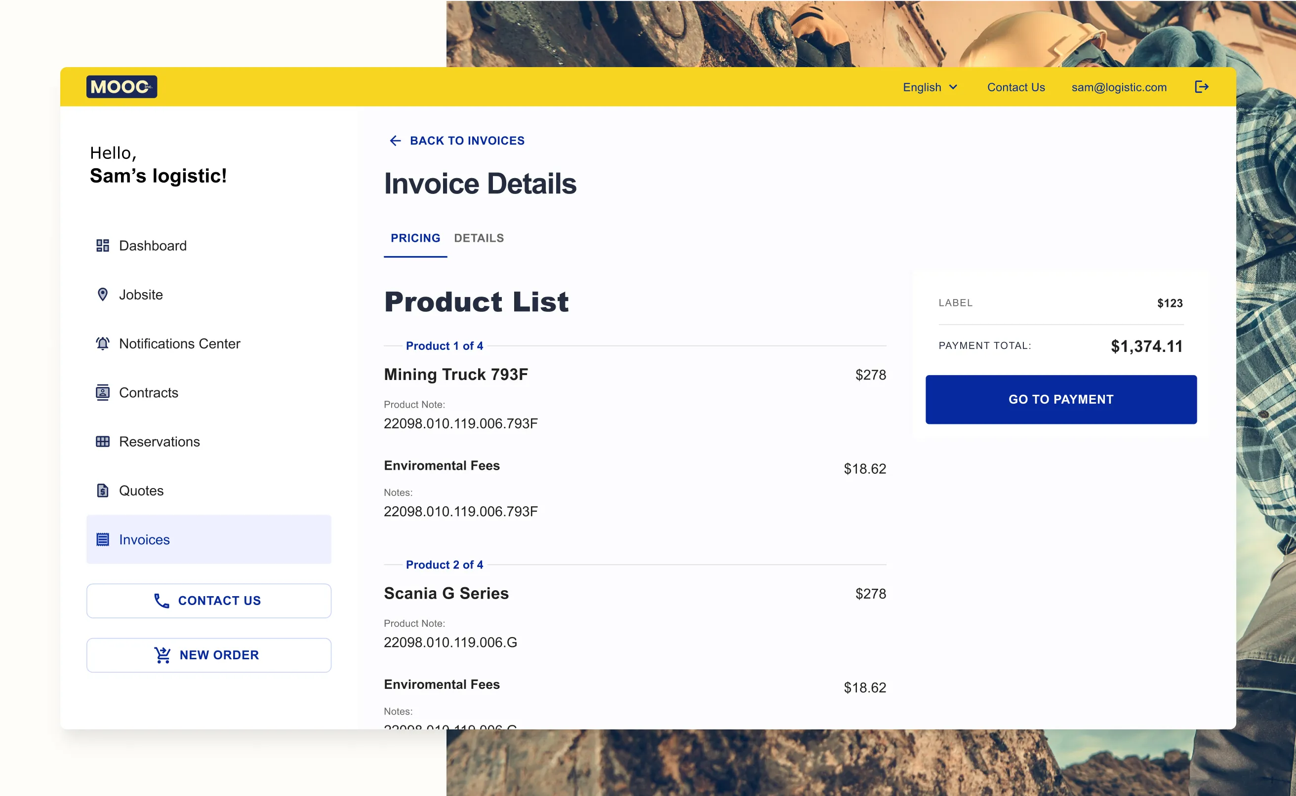
The process was thorough and methodical. I began by gathering detailed information about the business and their clients to establish clear user goals. From there, I created user flows, sitemaps, wireframes, and detailed UI designs. Using Figma, I developed interactive prototypes and conducted thorough user testing scenarios.
Curious to see the outcome? Let's jump to the last part.
User Testing
I prepared a prototype with defined objectives and tasks to assess the usability of the product. I created test scenarios, developed a rating matrix, and provided guidelines for interviewers on how to conduct user interviews and ask relevant questions.
I set the following goals:
- Identifying problems in the design of the product or service
- Uncovering opportunities to improve
- Learning about the target user’s behaviour and preference
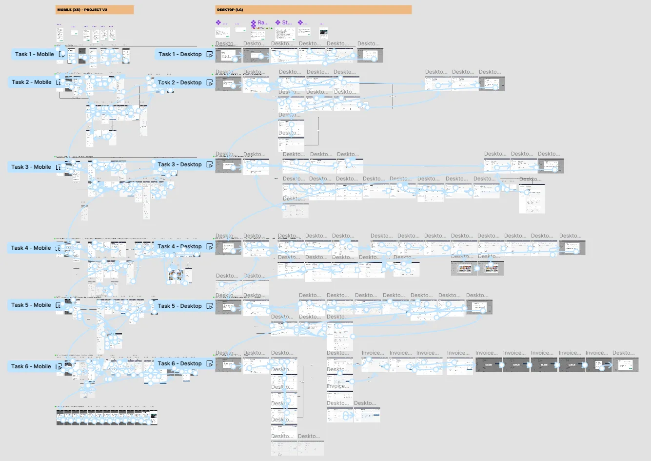
Prototypes
I performed Desktop and Mobile prototypes and manuals for facilitators regarding all the required information such as settings on resolution, customised to the participant’s screen width or not showing Figma UI etc.
Testing goals
I set testing goals, for instance to assess whether the portal is accessible to users and more specific referring to the application features.
Screening Questions
Participants were provided by the Client, therefore pre-test questions wasn’t needed. I used warm-up questions to get to know how work day usually looks and what tools they use. It gave me wider context in terms of testing questions.
Succes rate
I wanted to gauge if the user completed the task, faced roadblocks to finish the task and took another path to completion, or didn’t finish the task.
Testing questions
I set 7 tasks, questions and success criteria for each of them, for instance: Find an active [specific contract], review it, and reorder the contract.
Success criteria
Participants can find a particular jobsite easily and reorder it accurately. Questions: How easy was it to solve your task on a scale of 1 to 5? (where 1 means very difficult and 5 means very easy). Do you have any comments before we proceed to the next task?
SUS measure
I used a series of 10 Likert scale questions to measure usability of an entire system, in order to gather participants insights and pinpoint usability pitfalls.
Follow-up Email
The last step was to inform of receiving an email after the meeting and encourage leaving additional feedback.
Conclusion
Through this project, my skills levelled up. I tackled UX challenges head-on to streamline efficiency and showcased my ability to create user-friendly interfaces that meet diverse needs.
Ready to elevate your project with a tailored design solution? Let’s connect, hello@joannarybak.com and see how I can help you achieve your goals.

Grzegorz Zięba
co-founder @Ikona, co-founder @Design Allies

Next Project
See how I brought the story to life with simple yet effective animation.